Plugin Review – BuddyPress Registration Groups
https://wordpress.org/plugins/buddypress-registration-groups-1/
Version Tested: V 1.2.1
BuddyPress Registration Groups is a plugin that adds a list of groups to the registration form so that new members can be introduced and choose to join your groups. It means they don’t need to go looking for them to be instantly tied in to their preferred groups. Adding this kind or form to your registration can help you to build a profile for each new member.
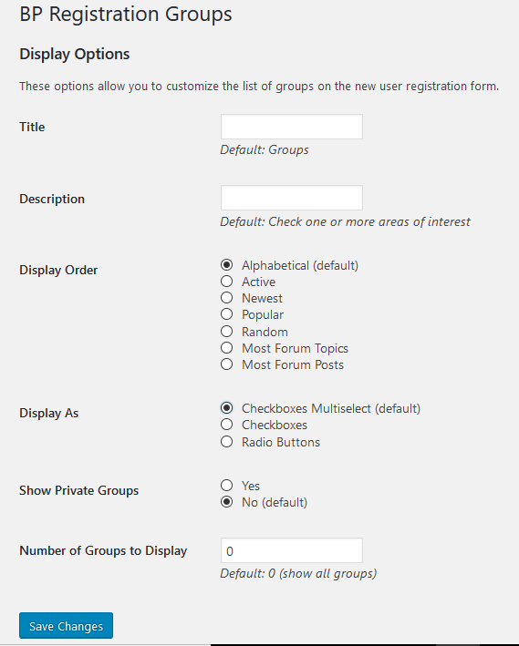
Installing BuddyPress Registration Groups is a simple case of uploading and activating the plugin, from their you need to go to Admin>>Settings>>BP Registration Groups. You will see the following Settings screen:

The main gotcha is showing too many groups in the registration form, creating a cumbersome form, you are able to limit the number of groups shown and the selection criteria allow you to show your top ten groups for new users to join. I think one interesting enhancement to this would be the ability to specify exactly which group to show in which order. Then you could choose to actively promote specific groups, but as it is this is a very useful plugin.
One aspect of this plugin is how it can help with the prevention of spammers. By filling out their group preferences at sign up your users are helping you paint a picture of them, which helps if you are actively moderating new members.
This plugin really does help kick off site participation, I think it’s one of the most useful BuddyPress registration plugins around.
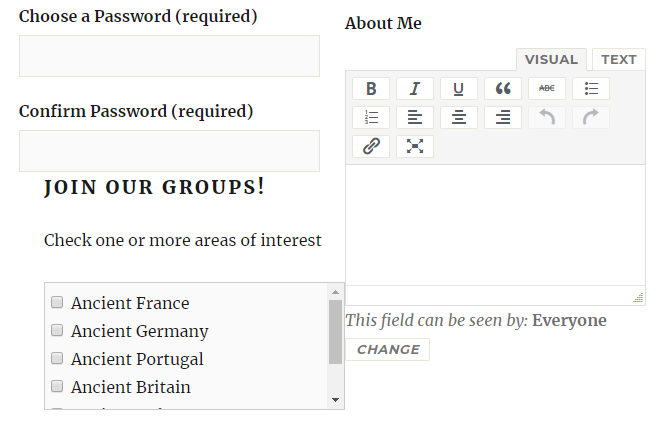
One aspect that new users may come across that may cause difficulty is the default layout and position, as I encountered when testing this plugin. Out of the box and using the 2015 Theme I had the following registration screen:

As you can see the “JOIN OUR GROUPS” text is sitting a little too close to the input box above it. The entire block is sitting to the right, instead of the left and also in my instance the group selection box is a little too wide.
To fix this, you need to know a little CSS – a task made simpler thanks to the Customizer Additional CSS tab. By using my browsers Inspect Element function I was able to determine that the css element that controlled this box was #registration-groups-section, from there it was a case of a bit of trial and error to get things right, I ended up with the following inserted code:
#registration-groups-section {
float: left;
width: 40%;
Height: 300px;
padding-top: 8px;
}
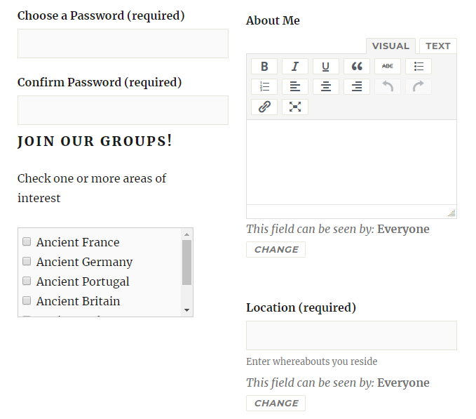
After applying my fix, the registration page looked as follows:

Obviously there’s other CSS elements that need to change to get this form looking really good, but this is just an example of what you can do.
Overall I give this plugin 10 out of 10, it works really well, is stable and well maintained, it usually needs a few tweaks in CSS but so does most of WordPress! I think there is more room for development but actually I’m pretty happy with the plugin as it stands!
My Star Rating:


3 Comments
Carsten R. Jensen · January 19, 2021 at 2:16 pm
Hi, is it possible to place this group registration feature on a stand-alone page?
My users create their accounts using social media login, so they would need to be redirected afterwards to a page where they choose their BP group.
Is that possible?
Thank you,
Carsten.
Venutius · January 19, 2021 at 2:53 pm
It’s not my plugin so couldn’t say, you need to ask the plugin author.
Imran · March 14, 2022 at 12:53 pm
I am using this plugin. But the problem is when I am registering by selecting a specific group, that time I am seeing the registered user showing all groups in the admin section. This registered user only should add in the specific group which group he selected while registering.
Any solutions?